HONEYCOMB
CREAMERY
A rebrand for a Cambridge ice cream shop that feels whimsical, bold and indulgent, and lets its inventive flavors speak for themselves.
Role
Brand strategy & identity
Course
Food & Restaurant Branding with Douglas Riccardi, The Cooper Union
Timeline
4 weeks, April 2026
Deliverables
Positioning, identity concepts, and mockups of packaging, signage, menu, website and socials
The goal
Create an ice cream shop brand that feels whimsical, bold and indulgent while highlighting Honeycomb's handcrafted, locally sourced magic.
The shop
Honeycomb Creamery serves small-batch flavors made with local ingredients in Cambridge, MA. Even the sprinkles and honeycomb candy are made from scratch. The menu balances the nostalgic and the inventive, and there's a line out the door every day, even if a few flavors are crossed off by the time you reach the front.
Who it's for
Local families and students, drawn in by flavors and toppings they can't get anywhere else, and coming back for the childlike thrill that a new favorite might be one scoop away.
01 · Today's scoop
Where the brand was melting
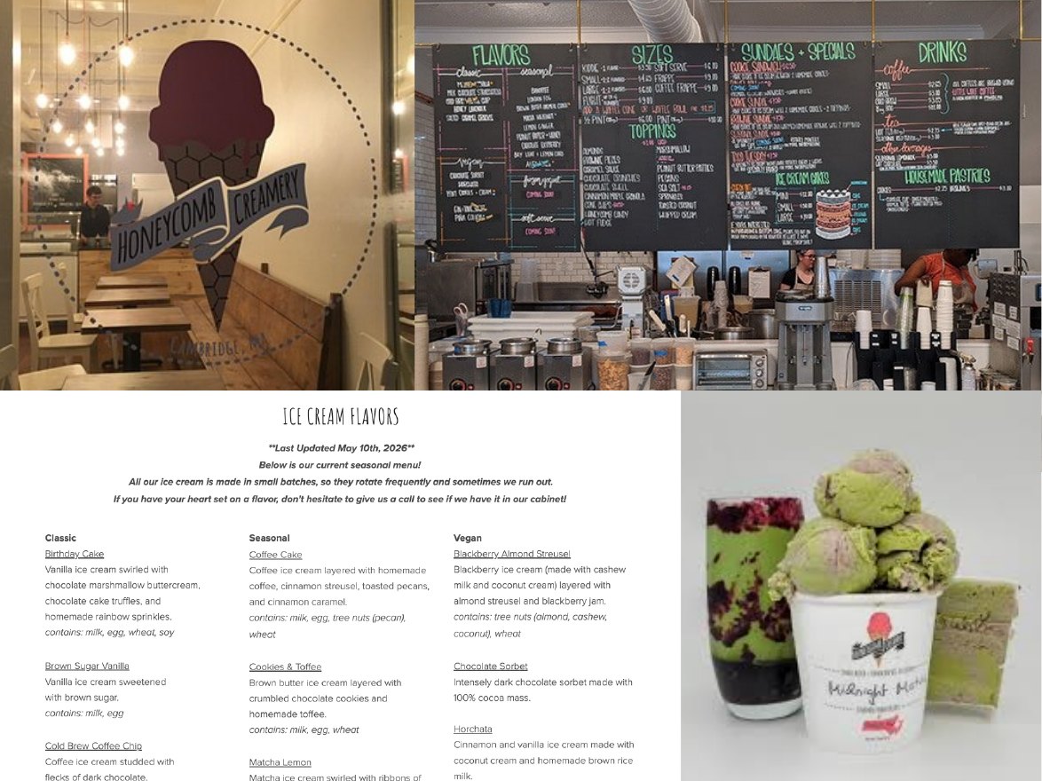
A forgettable logo
A sterile interior that doesn't match what they serve
Unbranded cups
Creative flavor names, but no descriptions in the shop
Socials that are consistent but underwhelming
Nothing explains what honeycomb is, and there are no samples
The big idea · time to rotate
Let the inventive flavors speak for themselves, with branding that's indulgent, informative and fun.
02 · Exploring
From mood board to marks
I started with inspiration beyond the usual ice cream clichés, then sketched two concepts and four logo directions by hand before narrowing in.
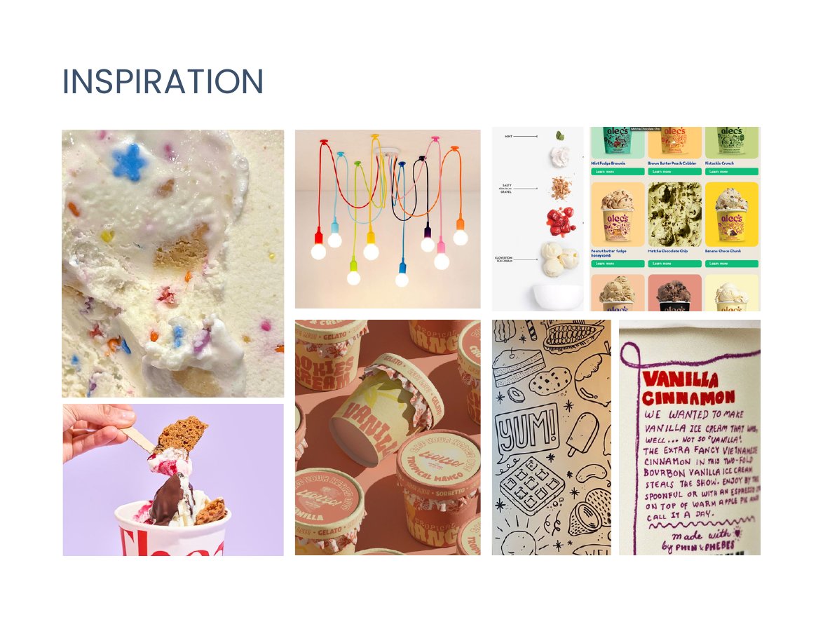
Week 1 inspiration board
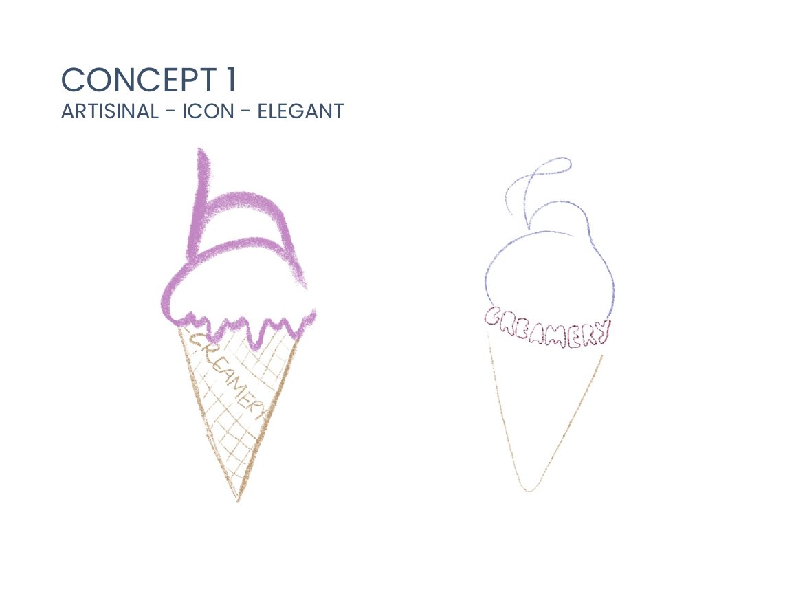
Concept 1: artisanal, iconic, elegant
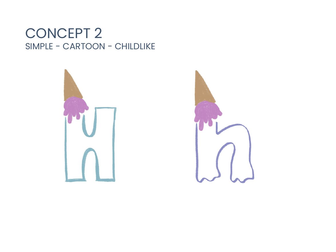
Concept 2: simple, cartoon, childlike
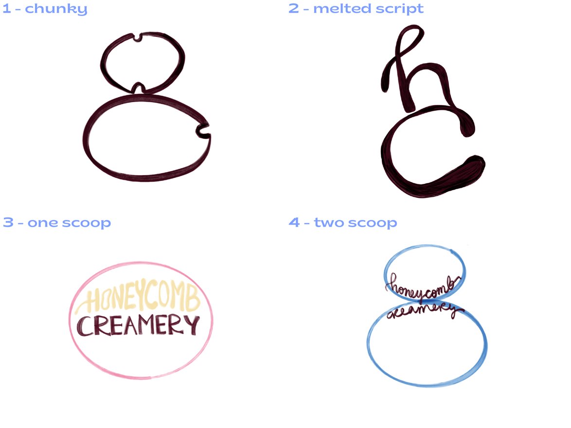
Week 3 logo directions: chunky, melted script, one scoop, two scoop
03 · Design development
Chunky, drippy, a little sweet
Where the identity stood after week 4. These are still concepts, not a final system: the direction I was refining, with logo, color and type options.
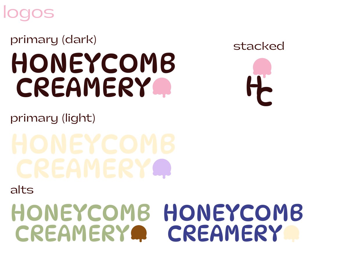
Logo concepts
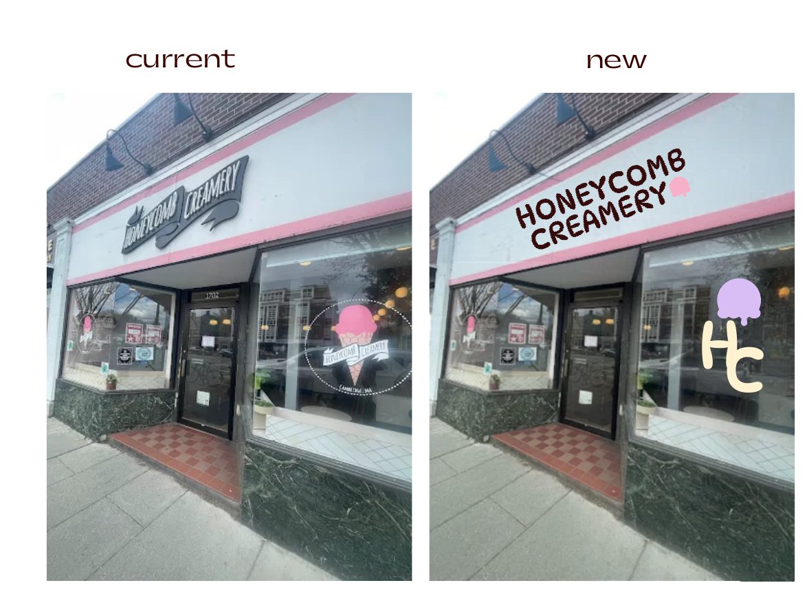
The storefront, current vs. concept
Logo
The leading concept: an all-caps wordmark topped with a melting scoop, plus a stacked HC monogram for small spaces, explored in dark and light versions and in the seasonal colors.
Type
DYNAPUFF for titles, always in caps · Gatwick for headers · Placard Next Wide for everything else
Color concept: primary
Color concept: one per season
04 · In the shop
Menu, cups & pints
Mockups showing how the concept direction could come to life in the shop.
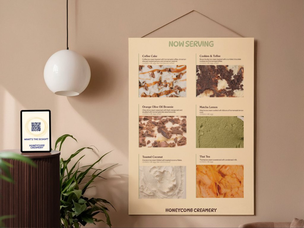
A “Now Serving” board that finally describes each flavor, with a QR stand for the full list.
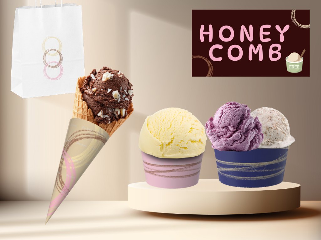
Branded cups, cone sleeves and to-go bags.
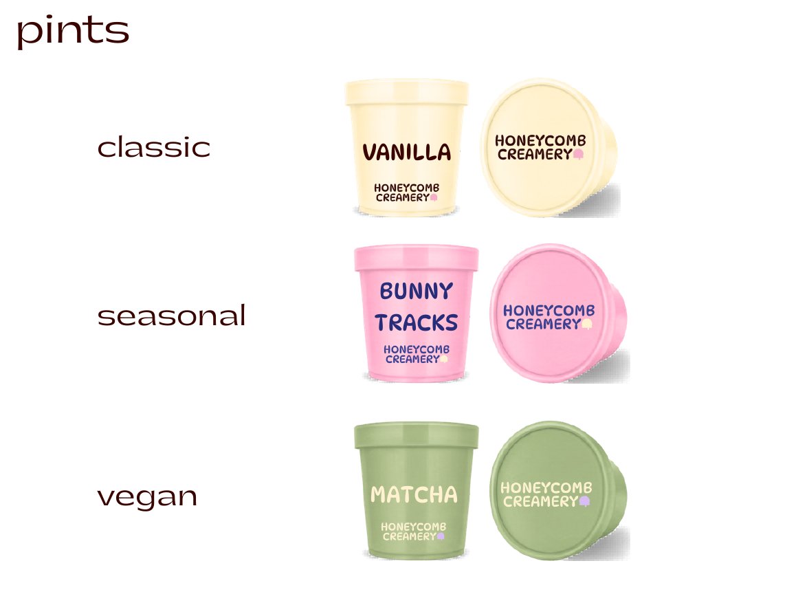
To-go pints color-coded by line: classic, seasonal and vegan.
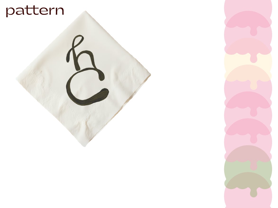
Napkins and a dripping-scoop pattern.
05 · Online
Website & socials
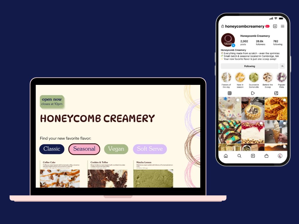
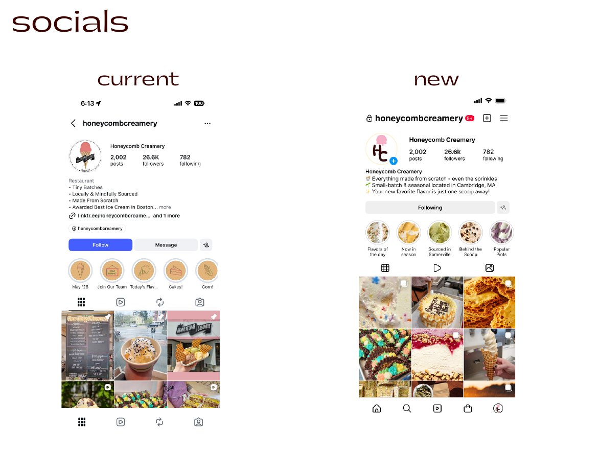
In this mockup, the website lets you filter flavors as Classic, Seasonal, Vegan or Soft Serve, and an “open now” badge shows today's hours. On Instagram, concept highlights cover flavors of the day, what's in season, local sourcing and behind the scenes.
Toppings
Beyond the logo
Flavor stories
Social posts that break down flavors, toppings and cakes, and show how new flavors get brainstormed.
Local roots
Spotlights and events with the farms and businesses behind the ingredients.
On the road
An ice cream truck for colleges and local events.
Little extras
A punch card, laser-cut logo spoons and, please, a few samples.
What I took away
Looking back, I wish I’d focused more on building the brand as a whole rather than just the logo. There’s so much of a story to tell in a rebrand, especially for a local, handcrafted spot like this one. Having such a blank canvas opened up endless possibilities, and I really appreciated that freedom.